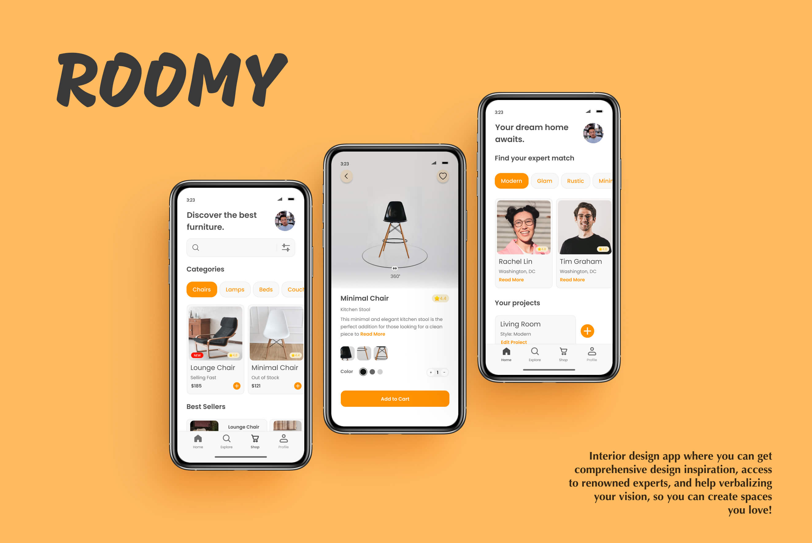
About project
but they need an intuitive, timely tool that doesn't break the bank!
Goal: Develop a responsive, mobile-first web app for users to gather inspiration, access experts, and verbalize their vision. Gather user and market insights, study factors influencing self-motivation, and optimize user and business goals.
Tools: Figma, Sketch
Design process
The design process included market and user analysis, prototyping, usability testing, collaboration, and design to create an intuitive and engaging app.
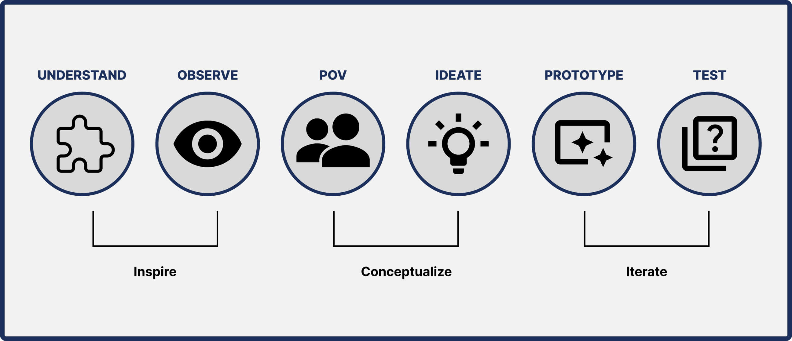
Understand & Observe ↑
Competitive Analysis
After getting valuable information on market competitors, I found an opportunity to create a guided interior design process, focused on customer and expert satisfaction, that tailored services to people's style and budget preferences.
User Research
I interviewed individuals with diverse experiences in online design tools and recent space design to align my product with their expectations, thereby enhancing user satisfaction. These insights were used to drive my user-centered design process.
POV & Ideate ↑
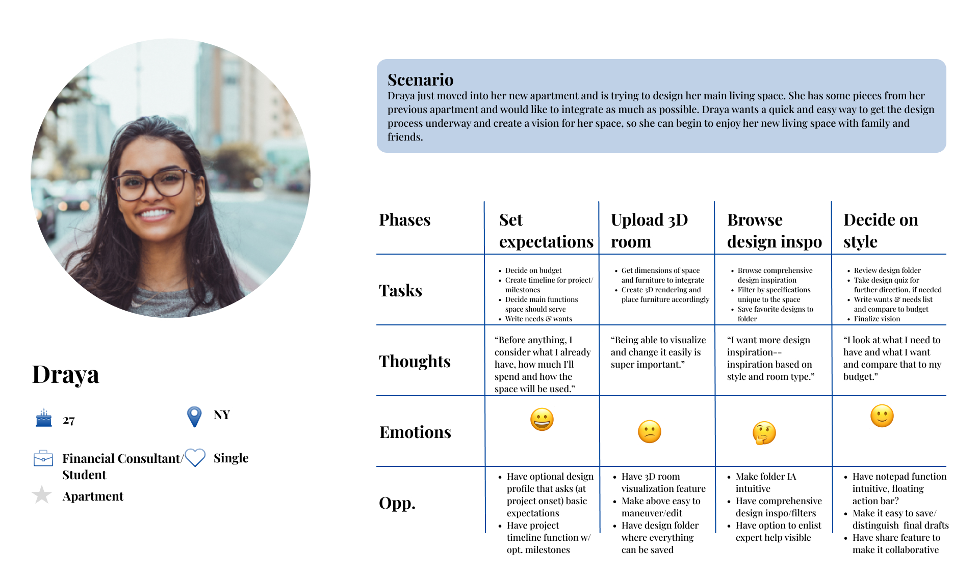
Creating my Personas
To understand users, I crafted personas reflecting their needs, goals, and motivations. Using insights from interviews and affinity mapping, I developed two personas for reference. Sara, my primary persona, emphasized the significance of personalized design inspiration.
Sara, The Working Mom
User Journey
I mapped out user journeys to visualize user interactions with Roomy and uncover opportunities for improvement. One opportunity I found was creating a structured way of organizing and matching experts to users.
User Flows
Then, I crafted user flows to visualize the functionality required for goal achievement. I focused on finding an intuitive "happy" path.

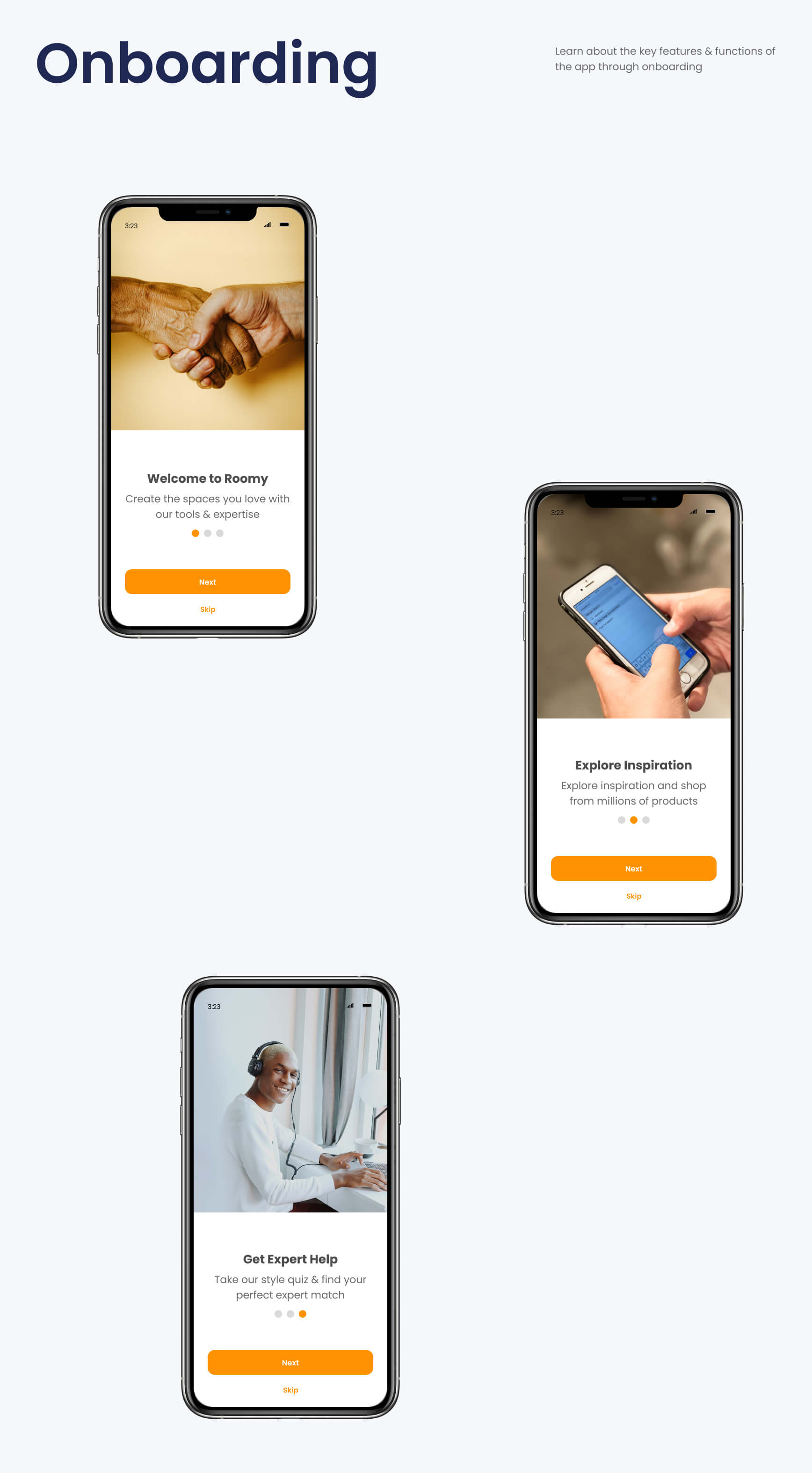
Prototype & Test ↑
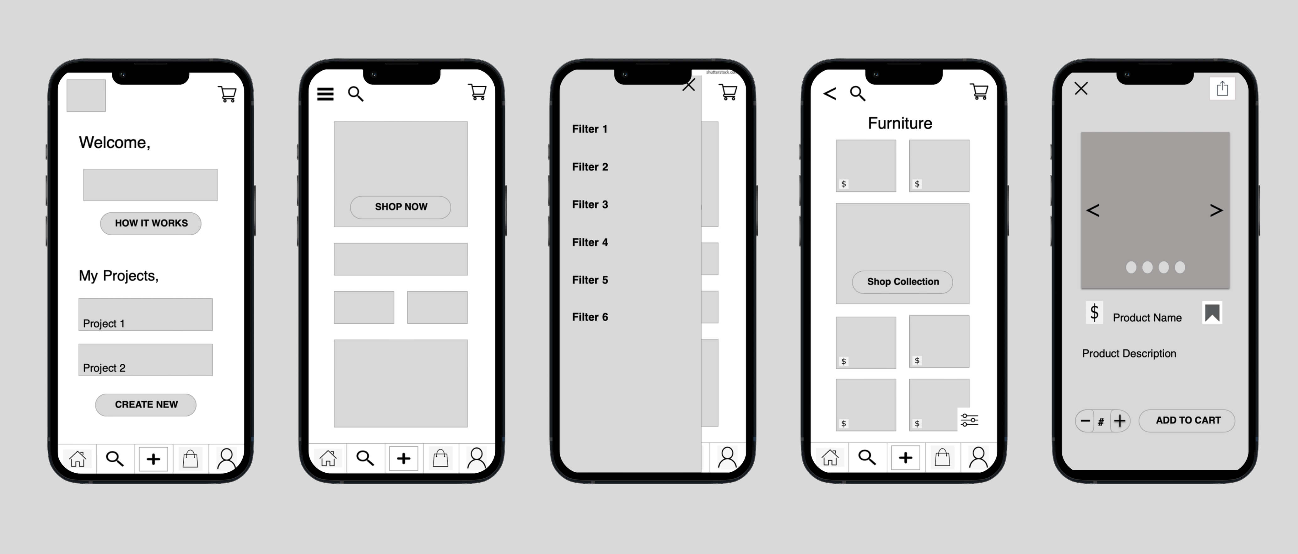
Low-Fi Sketches
I understood the organizational structure and refined it with a closed card sort. With a clear grasp of Roomy's key content and features, I began sketching using pen and paper to swiftly test my ideas without getting stuck on one.

Wireframing & Prototyping
After establishing core functionality, I progressively integrated more detail and interactivity into my screens. This evolution in design fidelity lead to high-fidelity prototypes and ultimately a clickable prototype for user testing.
Here, I learned the dangers of premature content inclusion as it diverted attention from high-level functionality during usability testing. I also saw how keeping it simple in turn made it simple for users to move through and enjoy the app.
User Testing
With my interactive prototype ready for testing, I formulated a concise test plan outlining objectives. I defined essential tasks for participants, and carried out both remote and in-person usability sessions with 5 participants. Post-interviews, I analyzed data through affinity mapping.

Affinity Mapping
100%
of participants had issues accurately identifying bottom navigation bar icons.
50%
of participants had issues recognizing the bookmark icon.
100%
of participants were confused by the "Explore" tab being the default setting on the Explore page.
80%
of participants were confused on the "Create New" button's intended function.
Final Iteration ↑
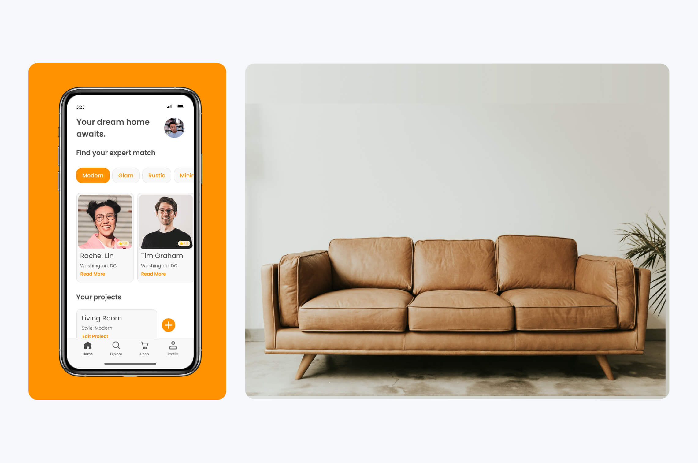
UI Design
Guided by usability and preference test insights, I refined my designs. This stage focused on establishing coherent branding and visual design in harmony with Roomy's mission. Applying design principles like Gestalt, I honed my screens, developed a unified Design System Language, and verified my designs with fellow designers.
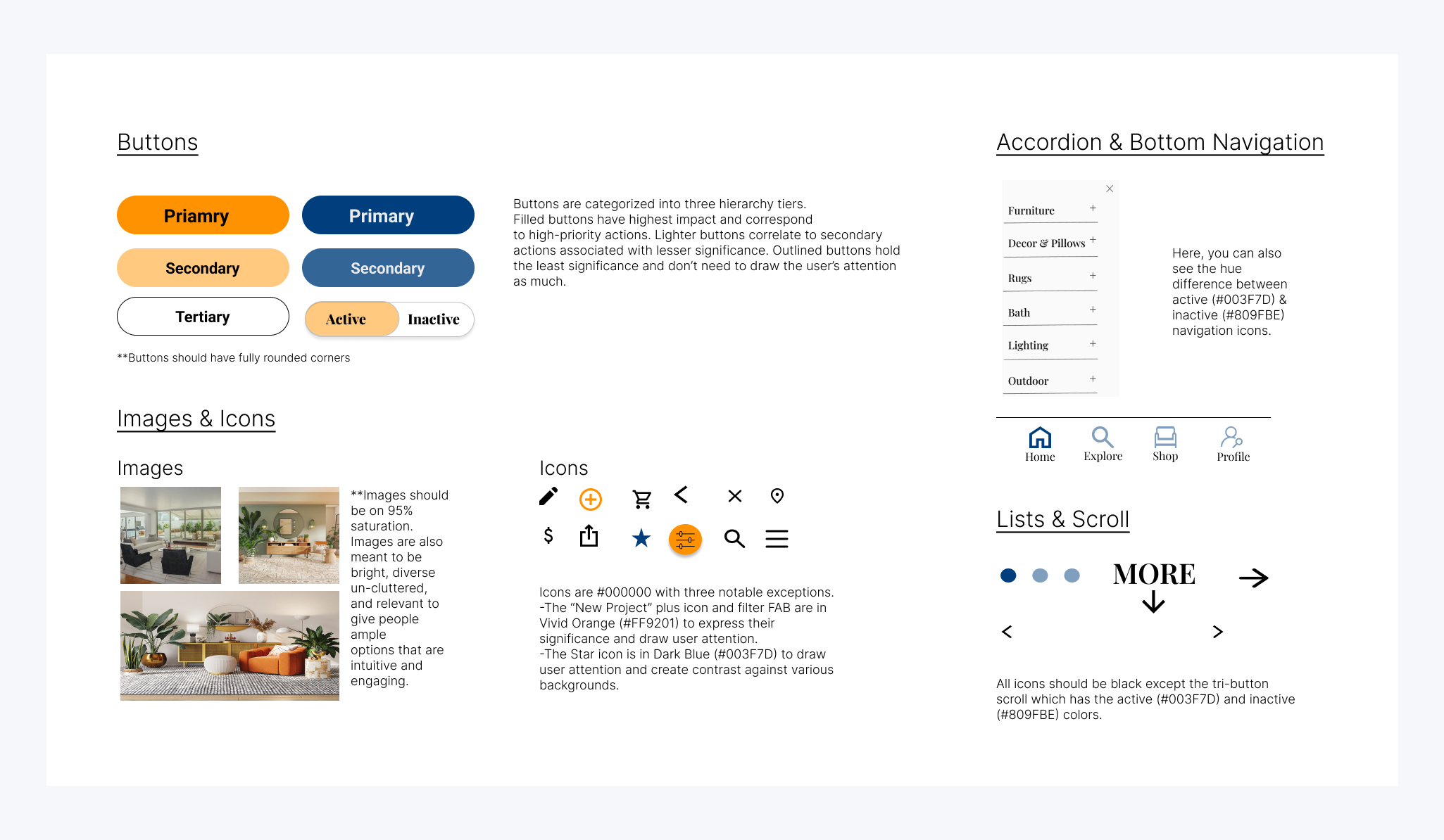
Colors & Typography
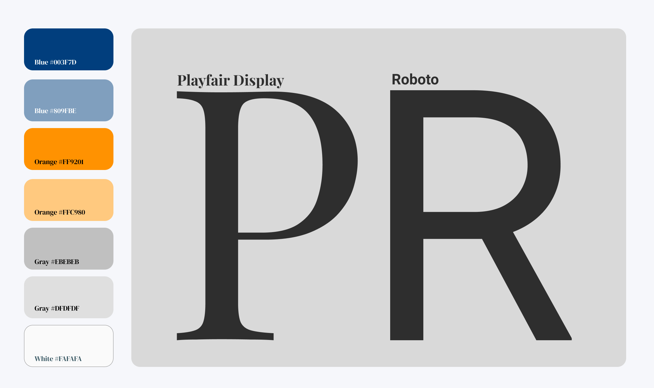
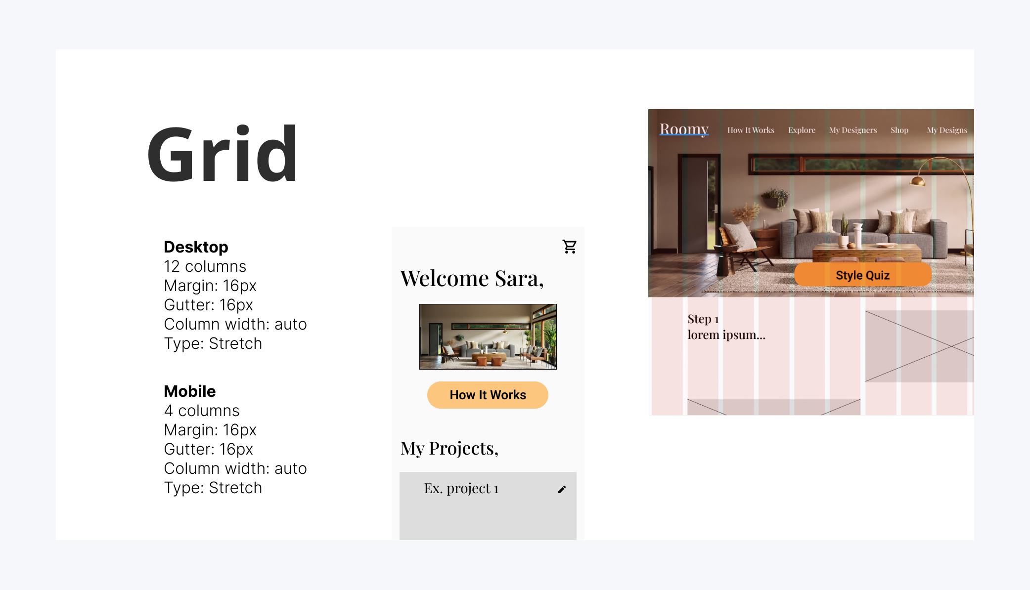
UI kit
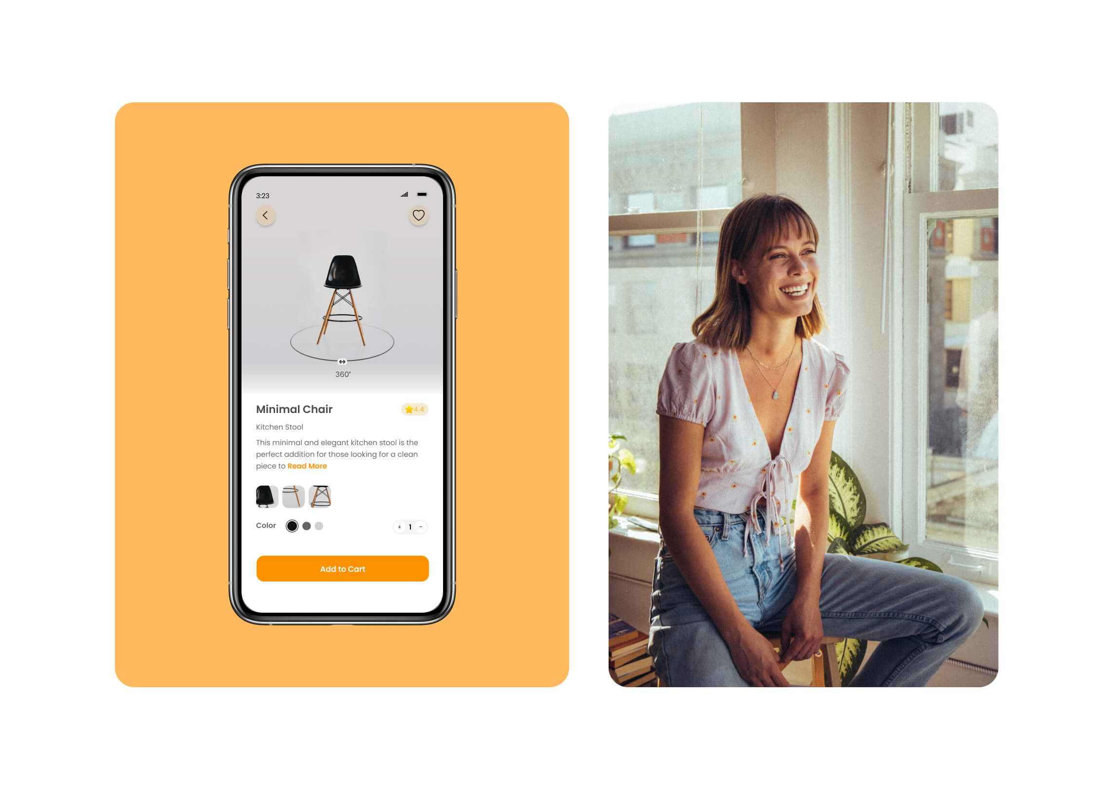
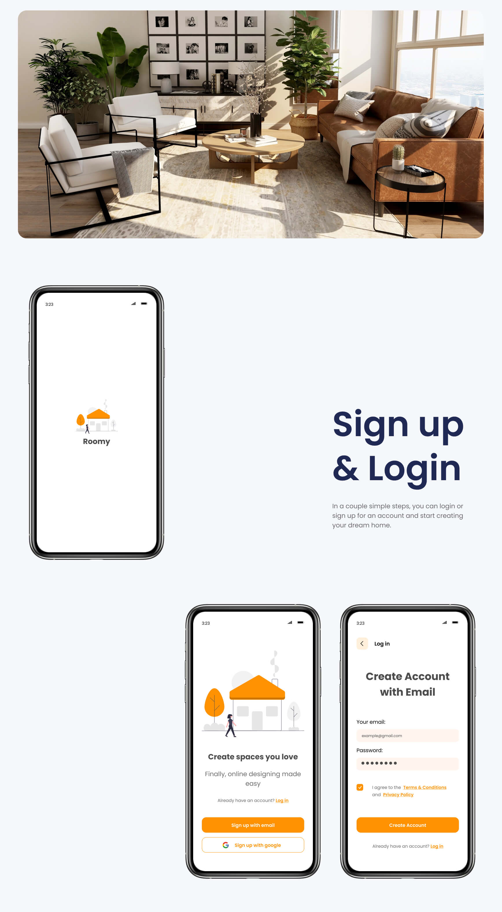
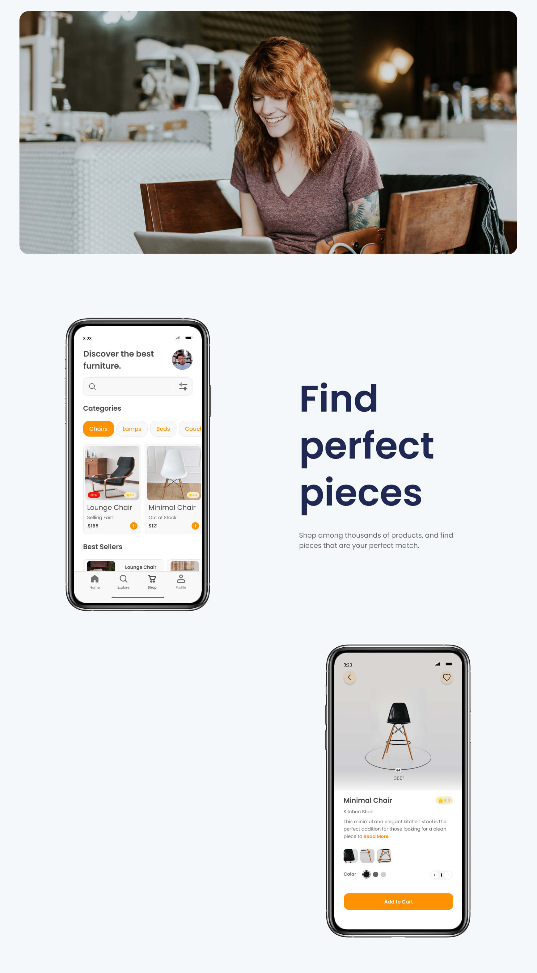
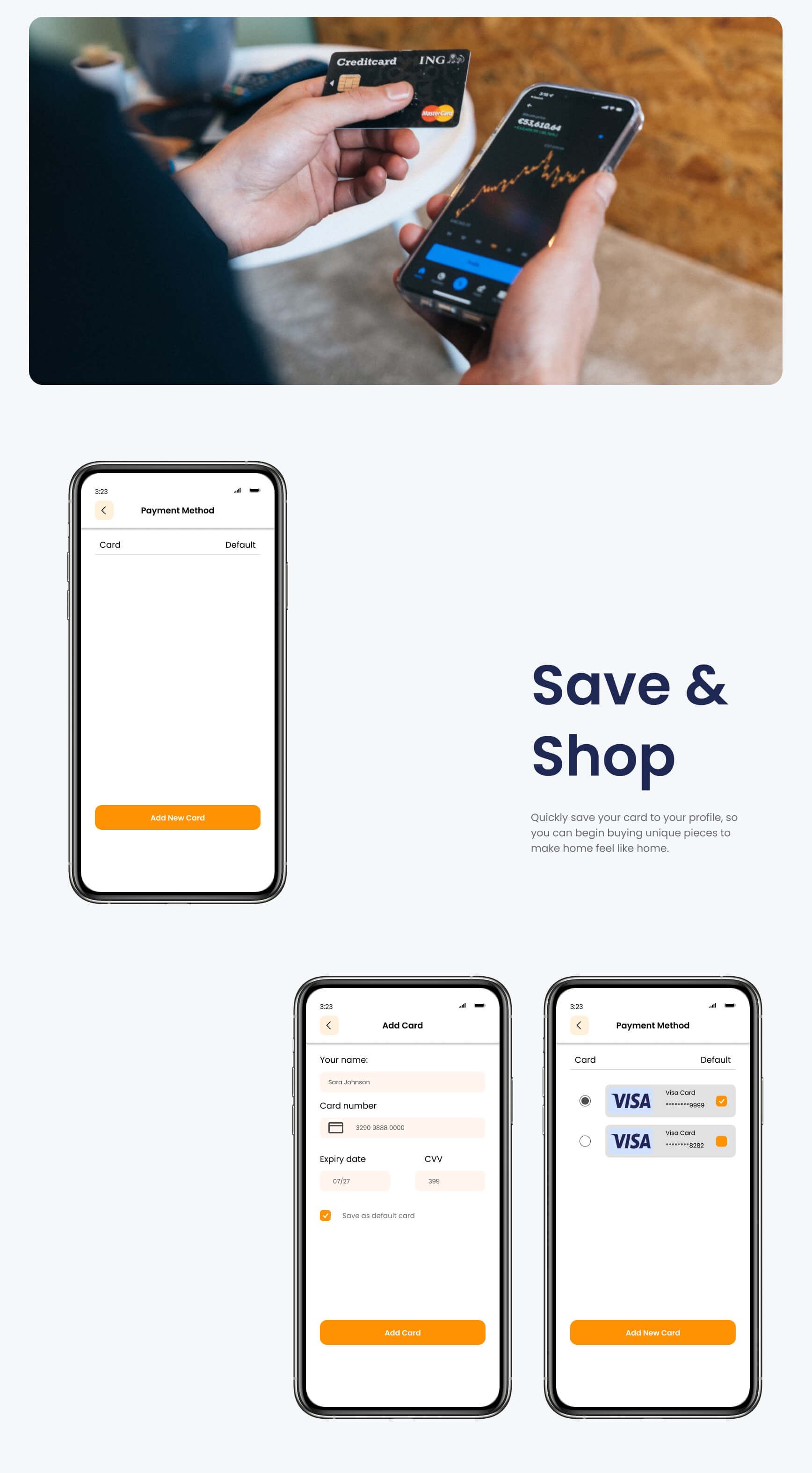
Final Iteration
I created a language for unified cohesion across platforms, products, and features. Collaborating with the design community, I refined designs by adjusting text size, enhancing image text visibility, and introducing a carousel feature. After four iteration rounds, screens not only fulfilled user persona needs intuitively but also resonated with the Roomy brand, blending visual appeal with functionality.
Click here for the final clickable prototype!
Conclusion
From research to refining my designs, creating the Roomy app was a challenging yet rewarding experience. Throughout the process, I clarified goals, matched results to hypotheses, and embraced change from new insights. My designs drastically improved over time due to intentional iteration ensuring a useful AND time efficient product. Interestingly enough, this process mirrored many cognitive and neuroscience frameworks making the design process a familiar stranger.
This project underscored the value of balance. Each design stage imparted unique lessons, warranting dedicated time. Yet, certain comprehensive insights emerged only from prototypes and testing. Working in healthcare, particularly during COVID, informed my ability to balance demands and employ methods appropriately.
Moving forward, I'll rely on iteration. Enhancing community engagement through a community page, blog, and more sharing options can attract users to Roomy. This can be evaluated through user surveys and usability tests with engagement-focused app versions. Transforming the app's appeal from redecoration necessity to community attraction holds significant potential.
Takeaways
01
Balancing design collaboration is essential. While some suggestions resonated, others didn't align with user research. Skillfully assessing feedback is crucial.
02
During the design process, I integrated user testing throughout. I saw the wealth of diverse knowledge and direction this gave my design process.
03
I discovered diverse testing methods, and learned sometimes, no significant difference emerges I learned this finding is just as important as a clear difference.
Thank you for reading my case study! ↑
Miriam Desta